 Top Mutual Funds

Learning Modules Hide
Hide
- Chapter 1: Introduction to Technical Analysis: Free Online Courses
- Chapter 2: A Course for Different Types of Charts in Technical Analysis
- Chapter 3: Learn Trends, Support, and Resistances
- Chapter 4: Free Technical Course on basics of Breakouts, Stops and Reversals
- Chapter 5: Learn Fibonacci Retracements
- Chapter 6: Learn Candlestick Patterns: Understand One and Two Candle Patterns
- Chapter 7: Learn Candlestick Patterns: Understand Three Candle Patterns
- Chapter 8: Introduction to Chart Patterns
- Chapter 9: Learn Moving Averages and Crossovers in Detail
- Chapter 10: Understand the Price by Volume Analysis in Detail
- Chapter 11: Learn MACD and Stochastics Technical Indicators in Detail – Part 1
- Chapter 12: Learn Bollinger Bands and Relative Strength Index (RSI) Technical Indicators - Part 2
- Chapter 13: Know the Do’s and Don’ts for Effective Trading Using Technical Analysis
Chapter 2: A Course for Different Types of Charts in Technical Analysis
Technical analysis as a discipline is highly versatile. Consider this analogy carefully! Once you learn to ride a scooter, you can ride any scooter, and that too in any part of the world, irrespective of terrain conditions. Likewise, you learn technical analysis once and can apply its techniques across asset classes and markets. On the contrary, the fundamental analysis of each asset class will differ.
The versatility of technical analysis lies in the fact that its principles and indicators can be applied to any asset that has historical time series data, especially O (Open), H (High), L(Low), and C (Close). OHLC data points also serve as an ideal way to understand trading action for a specific stock.
Charts help us display and visually analyze the above data points across periods. The most popular type of charts used by technical analysts are;
a. Line and Bar charts
b. Candlestick charts
c. Renko charts
d. Point and Figure charts

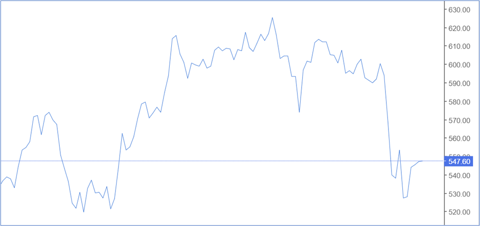
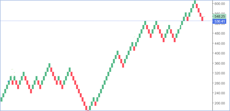
Line and Bar charts
A simple line chart is one of the most fundamental charts analysts use. It uses only one data point (usually the closing price). This chart is formed by plotting the closing prices as dots and using a line to join them. A line chart can be plotted for different time intervals. You can have a weekly, monthly, or hourly line chart or customize it for different time intervals. The simplicity of a line chart lies in the fact that a trader can understand the underlying trend instantly by looking at the chart. A line chart is typically used when you want to track and monitor price changes over short and long periods. The most significant disadvantage is its simplicity, as it only provides information about the trend. Check out the sample line chart below.
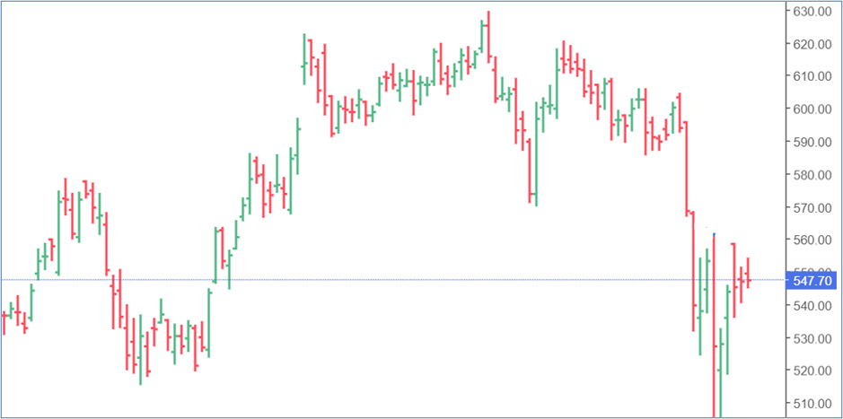
A bar chart, on the other hand, is a lot more dynamic than a line chart. It depicts Open, High, Low, and Close price information. A bar chart has three components; the middle line, the left mark, and the right mark. The top of the central line indicates the highest price reached by the stock. The bottom of the central line shows the lowest trading price on the given day. The left mark indicates the open price, whereas the right mark indicates the close price. A blue/green chart shows a bullish trading session, whereas a red one indicates a bearish one.
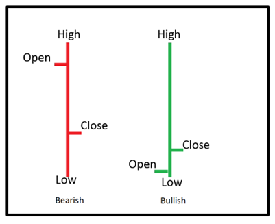
OHLC chart belongs to the family of the bar chart. You can use Bar Charts to monitor trends, trend reversals, volatility and price actions.
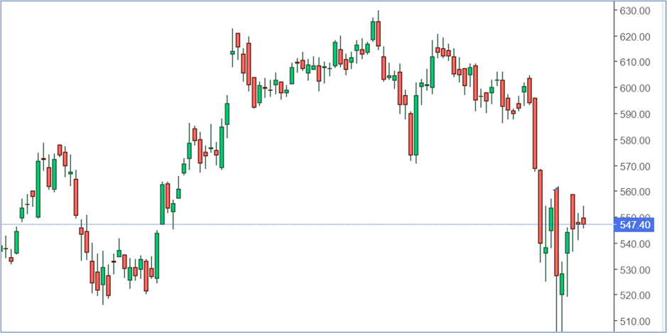
Candlestick charts
While candlesticks remain one of the oldest charts to be used for price analysis in Japan, the Western world became aware of this charting technique only in the 1980s. Let us look at the anatomy of a candlestick chart. While in a bar chart, the open and close prices are depicted by a tick/mark on the right and left side of the middle bar, whereas, in a candlestick, it is represented by the rectangular ‘body’ of the candle. Bullish candles are blue/white/green/hollow in color, whereas bearish ones are orange /red/black. However, most technical analysis platforms allow you to customize the color of the candlesticks. Look at the figure below to understand the interpretation of candles. These charts can be used by you when you want to identify and determine possible changes in the price based on past price patterns.
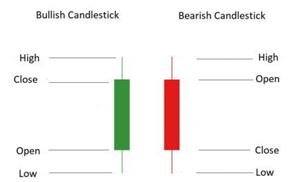
In the case of a bullish candle, the real body (rectangle) connects the open, and the close price and the close appear at a higher level than the open price. The upper wick/shadow connects the high and the close price, whereas the lower shadow/wick connects the open and the low price (as depicted in the above figure)
A bearish candle has a rectangular body where the opening price is seen at the top, and the closing price appears at the bottom of the candle. The upper shadow of a bearish candle connects the high and open price, whereas the lower shadow connects the low and the close price. Checkout the candlestick chart below:
Candlestick charts originated in Japan in the early 18th Century. Homme Munehisa, a rice merchant, is credited with inventing this chart form to analyze the price of rice across markets.
Renko charts
Renko charts, like the candlesticks, are also traced back to Japan. A regular chart uses price and standardized time intervals, while a Renko chart uses only the price movements rather than price and time. The name ‘Renko charts’ is derived from the Japanese word ‘Renga’ which means a brick/block of stone. Renko charts look like bricks stacked against each other at a certain angle. A new brick/block is created every time the price moves by a certain measure, and this brick is positioned at a 45-degree angle, either up or down, signifying the price is moving up or down. Renko charts can be effectively used to identify support and resistance levels compared to candlesticks, as Renko charts capture less noise than candlesticks. A Renko trader can also ride a trend for a longer time, especially when a strong trend forms. The block/brick is green when the price moves up, and it is colored red when the price moves down. (look at the figure given below)
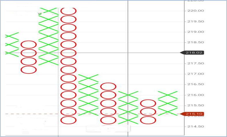
Point and Figure chart
Point and Figure charts plot price movements for assets like equity and commodities without considering time intervals. Point and figure charts appear distinct as they utilize a series of stacked ‘X’s and ‘O’s. These ‘X’s and ‘O’s represent a set price movement. The ‘X’s represent rising prices, whereas ‘O’s indicate falling prices. Although Point and Figure charts are easy to understand, they share a significant disadvantage. The Point and Figure charts are typically slow to react to price changes. So, when do you use Point and Figure Charts? You can use these charts to visualize trends without considering the period. Also, it provides easy visualization of support and resistance.
At the end of this chapter, you now know the different types of charts. Candlesticks are the most widely used charts. Understanding charts are critical as charts allow you to identify trends and analyze the various aspects of price movements. It will help you understand support and resistance levels and prices at entry and exit to make informed decisions.
Summary
- A line chart is formed by plotting the closing prices as dots and using a line to join them.
- OHLC data points also serve as an ideal way to understand trading action for a specific stock.
- A Renko chart uses only the price movements rather than price and time.
- In the Point and Figure chart, the ‘X’s represent rising prices, whereas ‘O’s indicate falling prices.
- Bullish and bearish candles are used in the candlestick chart. In the case of a bullish candle, the real body (rectangle) connects the open and the close price, and the close appears at a higher level than the open price. In the case of a bearish candle, the close price is lower than the open price.
The next chapter explains trends and their importance in technical analysis. We also learn the relevance of support and resistance in technical analysis.


COMMENT (0)